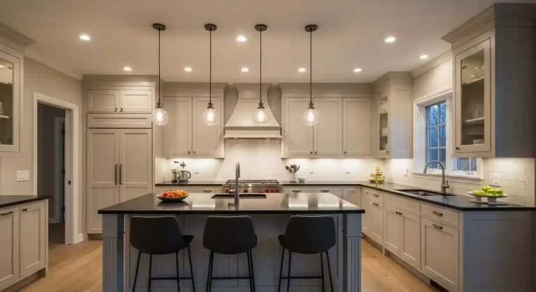
13 Cheerful Kitchen Color Ideas for Walls to Transform Your Space Effortlessly
This post is all about Gorgeous Kitchen Color Ideas for Walls.

Choosing the right wall color can significantly impact the overall look and feel of a kitchen.
It influences the mood, enhances the space, and can complement various design styles.
Whether you’re an enthusiastic home chef or someone who simply loves to sip morning coffee in a welcoming space, the wall color of your kitchen plays a major role in setting the tone.
Kitchens are more than just cooking zones—they’re conversation corners, memory makers, and sometimes even makeshift homework stations.
That’s why choosing a cheerful wall color isn’t just about aesthetics; it’s about creating a space where you and your loved ones truly feel at home.
Why Wall Color Matters in Your Kitchen
Before we dive into the color options, let’s understand why your kitchen walls deserve special attention. The kitchen is often the most used room in a home.
Lighting, cabinetry, countertops, and decor all come together in this space—but wall color can either harmonize the entire look or throw it off completely.
A cheerful palette can:
- Make a small kitchen feel bigger and brighter
- Energize the space and uplift your mood
- Set a welcoming atmosphere for family and guests
- Reflect natural light and improve the ambiance
By choosing the right shade, you can balance style with functionality and turn your kitchen into a space you truly love.
13 Cheerful Kitchen Color Ideas for Walls
This article provides 13 practical and attractive kitchen wall color ideas to inspire thoughtful choices.
These options help readers consider how color can transform their kitchen environment effectively.
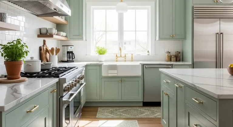
1) Soft Sage Green

Soft sage green is a muted, calming shade that works well in kitchen spaces. It offers a natural, earthy feel without being overpowering or too bold.
This color pairs nicely with white cabinets and light wood tones. It creates a balanced look that feels fresh and inviting.
Soft sage green also complements stainless steel appliances and matte black fixtures. It adds subtle color while maintaining a modern, clean aesthetic.
The shade adapts well to various lighting conditions, appearing warmer in natural light and cooler under artificial light. This flexibility makes it suitable for many kitchen styles.
Using soft sage green on walls can enhance a kitchen’s connection to nature. It is effective in creating a serene atmosphere, encouraging relaxation during cooking or dining.
2) Warm Terracotta

Warm terracotta brings a natural, earthy tone to kitchen walls. It creates a cozy and inviting atmosphere without feeling too dark or overwhelming.
This color works well with wooden cabinets and brass or copper fixtures, enhancing a rustic or Mediterranean style. It pairs nicely with neutral countertops and white trim for balance.
Terracotta can also serve as a good backdrop for greenery or colorful kitchen accessories. It adds depth and warmth while maintaining a timeless appeal.
The tone varies from muted to vibrant, allowing flexibility depending on lighting and room size. A well-lit kitchen benefits from a richer shade, while smaller spaces may suit softer terracotta hues.
3) Classic Navy Blue

Classic navy blue offers a timeless and sophisticated look for kitchen walls. It creates depth and contrasts well with lighter cabinetry and countertops.
This color works well in both modern and traditional kitchens. Navy blue pairs nicely with whites, grays, and natural wood tones.
It also helps hide dirt and stains, making it practical for high-traffic cooking areas. Adding metallic accents like brass or copper can enhance its rich appearance.
Navy blue can make a kitchen feel cozy without overwhelming the space. Proper lighting is important to balance its darker hue.
Subscribe to Cookwarely
Get updates on the latest posts and more from Cookwarely straight to your inbox.
4) Creamy Off-White

Creamy off-white walls create a warm and inviting atmosphere in the kitchen. This color balances brightness and softness, making the space feel clean without being stark.
It pairs well with natural wood tones and stainless steel appliances, offering flexibility in design choices. Creamy off-white also reflects light efficiently, enhancing the sense of openness in smaller kitchens.
This color works well in both traditional and modern kitchens. It provides a neutral backdrop that allows colorful accents like vibrant cabinetry or patterned tiles to stand out.
Overall, creamy off-white is a practical choice for those who want a timeless, adaptable wall color. It can subtly complement a variety of textures and materials without overwhelming the space.
5) Muted Mustard Yellow

Muted mustard yellow adds warmth to kitchen walls without overwhelming the space. It creates a cozy atmosphere that feels grounded and inviting.
This shade pairs well with natural wood tones and matte black fixtures. It can brighten a kitchen while maintaining a subtle elegance.
Muted mustard yellow works best in kitchens with good natural light. It balances boldness and softness, making it suitable for various kitchen styles, from modern to rustic.
6) Cool Slate Gray

Cool slate gray is a versatile color that brings a modern and calm atmosphere to a kitchen. It pairs well with stainless steel appliances and white cabinetry, creating a balanced look.
This shade works well in both small and large kitchens, adding depth without overwhelming the space. It reflects light subtly, helping to keep the room bright.
Designers often choose cool slate gray to create a neutral backdrop. It complements natural wood tones and colorful accents, allowing for flexible décor choices.
Using slate gray on walls can enhance textures like tile backsplashes or stone countertops. It provides a clean, sophisticated foundation for various kitchen styles.
7) Rich Charcoal

Rich charcoal is a versatile choice for kitchen walls. It adds depth without overwhelming the space. This dark gray tone works well with both modern and traditional styles.
It creates a strong backdrop for lighter cabinets or countertops. Whites, creams, and light wood finishes contrast sharply against rich charcoal, making features stand out.
The color also hides dirt and stains better than lighter shades. It is practical for busy kitchens while maintaining a sophisticated look.
Pairing rich charcoal with metallic accents enhances the sense of luxury. Stainless steel appliances and brushed nickel hardware complement this shade effectively.
Lighting is important when using rich charcoal. Natural light keeps the kitchen feeling open, while layered artificial light prevents it from feeling too dark.
8) Pale Blush Pink

Pale blush pink offers a soft and subtle hue that adds warmth without overwhelming a kitchen space. It creates a gentle backdrop that works well with both modern and traditional styles.
This color pairs nicely with white cabinets and natural wood tones, enhancing a sense of light and airiness. It also complements metallic accents, such as brass or copper fixtures.
Pale blush pink can bring a touch of elegance while maintaining a neutral feel. It is ideal for those who want a slight departure from classic whites or grays but prefer a calm, understated look.
The tone reflects natural light well, making smaller kitchens feel brighter. It can also contrast effectively with darker countertops or flooring for added visual interest.
9) Deep Forest Green

Deep forest green is a rich, subdued color that brings a natural and calming vibe to kitchen walls. It adds depth without overwhelming the space. This shade works well in kitchens with plenty of natural light to balance its intensity.
The color pairs nicely with warm wood tones and brass or gold hardware. It also contrasts well with white or cream cabinets, creating a sophisticated and earthy feel.
Deep forest green suits various kitchen styles, from modern to rustic. It can create a cozy, grounded ambiance, especially when combined with textured elements like stone countertops or open shelving.
10) Bright Turquoise

Bright turquoise adds a fresh and energetic feel to kitchen walls. It is a vibrant shade that balances the calmness of blue with the liveliness of green.
This color works well in kitchens that receive plenty of natural light. It can make smaller spaces feel more open and inviting.
Subscribe to Cookwarely
Get updates on the latest posts and more from Cookwarely straight to your inbox.
Pairing bright turquoise with white or light wood cabinets creates a clean, modern look. It also complements stainless steel appliances and chrome fixtures effectively.
Bright turquoise encourages a cheerful atmosphere without being overwhelming. Using it on an accent wall can bring color without dominating the entire space.
Careful consideration is needed to avoid clashing with other bold colors. Neutral countertops and backsplash tiles can help tone down the intensity.
Overall, bright turquoise is a strong choice for those wanting a bold yet pleasant wall color.
It provides a feeling of freshness and light that many kitchens benefit from.
11) Elegant Eggplant

Eggplant is a deep, rich shade of purple that brings sophistication to kitchen walls. It creates a warm and inviting atmosphere without feeling overwhelming or dark.
This color pairs well with natural wood tones and metallic accents, such as brushed gold or matte black. It works best in kitchens with ample natural light to balance its intensity.
Eggplant can enhance a modern or traditional kitchen style. It adds depth and interest when combined with neutral cabinetry and light countertops.
Using eggplant on one accent wall is a subtle way to introduce the color. For a bolder approach, painting all walls can create a striking backdrop for lighter furnishings.
Eggplant is versatile and suits those who want a unique alternative to standard kitchen colors.
It adds elegance while remaining practical for everyday use.
12) Warm Taupe

Warm taupe offers a balanced mix of brown and gray tones, making it a versatile choice for kitchen walls. It brings a subtle, earthy warmth without feeling too dark or overpowering.
This color works well in both traditional and modern kitchens. It provides a neutral backdrop that complements wood finishes, stainless steel appliances, and a variety of countertop materials.
Lighting plays an important role with warm taupe. Natural light can enhance its softness, while artificial warm lighting deepens its cozy appeal.
Pairing warm taupe with white trim or cabinets creates a clean and inviting contrast. It also blends nicely with natural textures like stone or woven baskets, adding to a comfortable kitchen atmosphere.
13) Crisp White with Blue Trim

Crisp white walls create a clean and timeless backdrop for any kitchen. Adding blue trim introduces a subtle pop of color that enhances the room without overwhelming it.
This combination balances freshness with a touch of personality. The blue trim can vary from soft pastel shades to deeper navy tones.
Lighter blues maintain an airy feel, while darker blues add contrast and definition. It works well for kitchens seeking a coastal or classic farmhouse look.
This color pairing highlights architectural details like window frames, door edges, and cabinetry outlines.
It draws attention to the kitchen’s structure in an understated way. The white base keeps the space bright and open, even in smaller kitchens.
Using blue trim also allows flexibility in accent choices. Accessories, textiles, and appliances in matching or complementary shades tie the design together.
This approach suits both modern and traditional kitchen styles effectively.
How Paint Color Influences Kitchen Atmosphere
Paint color directly affects the mood and perception of a kitchen.
It shapes how inviting or energetic the space feels and interacts with elements like natural light or room dimensions.
The Psychology of Color in Kitchen Design
Colors trigger emotional responses that affect how people feel in a space.
Subscribe to Cookwarely
Get updates on the latest posts and more from Cookwarely straight to your inbox.
Warm tones like reds and oranges can increase energy and appetite, making them popular for kitchens where socializing happens.
Cool colors such as blues and greens create a calming effect, suitable for kitchens intended as relaxing spots.
Neutrals—greys, whites, and beiges—offer flexibility and can make a kitchen feel clean and spacious.
Bold colors may stimulate creativity but can overwhelm if overused.
Pastel shades often impart softness and charm without dominating visual senses.
Considerations for Lighting and Space Size
Natural and artificial light change how paint colors appear throughout the day.
South-facing kitchens receive warm light, making colors look richer, while north-facing rooms get cooler, muted tones.
Small kitchens benefit from lighter colors that reflect light and enlarge the space visually.
Dark colors, although dramatic, can make a small kitchen feel cramped.
In large kitchens, deeper colors can be balanced with bright lighting and accents to avoid cold or dull atmospheres.
Proper lighting enhances the true color, preventing unexpected tones.
Tips for Choosing and Maintaining Kitchen Wall Colors
Choosing the right paint finish impacts durability and appearance.
Proper cleaning and care extend the life of kitchen walls, especially in high-moisture and high-traffic areas.
Selecting the Perfect Paint Finish
In kitchens, semi-gloss and satin finishes are the most practical choices.
Semi-gloss offers higher moisture resistance and is easier to clean, ideal for areas near sinks and stoves.
Satin provides a softer sheen but still withstands moderate scrubbing.
Avoid flat or matte finishes as they absorb stains and are harder to maintain in a cooking environment.
Consider paint with mildew-resistant properties for added protection.
Using high-quality, washable paints helps maintain vibrancy and guards against common kitchen issues like grease buildup.
Caring for Painted Kitchen Walls
Regular cleaning prevents grease and dirt accumulation.
Use a soft sponge or cloth with mild detergent and warm water.
Avoid abrasive cleaners or scrubbers that can damage paint.
Spot test any new cleaning product in an inconspicuous area first.
For stubborn stains, a baking soda paste gently lifts spots without harming the paint.
Wiping walls weekly or biweekly depending on cooking frequency helps preserve the finish.
Touch-up kits matching the original paint color can cover chips or marks promptly to maintain a uniform look.