23 Gorgeous Trendy Kitchen Color Ideas That Will Dominate 2025

Kitchen design is changing fast. Color is doing more of the talking now. Neutrals still have a place, sure, but 2025 is leaning bolder, warmer, more grounded.
Designers and manufacturers are shifting toward tones that reflect what people want more of: comfort, clarity, contrast, and maybe a little courage in the palette.
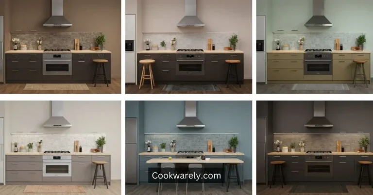
Here are 23 color ideas that are either already popular or gaining fast—and most importantly, they all actually work in real kitchens.
1. Clay Red

Clay tones like baked brick or burnt sienna are warm and saturated, and they add a grounded feel to the space.
These shades are showing up most often on lower cabinets and accent walls.
The key is to pair them with contrasting materials—like matte black fixtures or wood countertops—to create balance.
Clay red works especially well in kitchens with lots of natural light.
2. Deep Moss Green

This green is earthy and dramatic. Unlike lighter greens, moss green has depth and richness that give it a sense of maturity.
It’s popular in larger kitchens because it can make a space feel cozy, not cramped. Brass or gold hardware complements this tone perfectly.
3. Soft Sage

Soft sage is subtle, living between gray and green. It’s adaptable and fits into many kitchen styles—from minimalist Scandinavian to classic farmhouse.
It pairs well with butcher block countertops, light oak floors, and white tile backsplashes. This is a safe way to add color without overcommitting.
4. Sunshine Yellow

This color adds brightness and energy to any kitchen. Not as intense as lemon but more vivid than mustard, sunshine yellow is best used as an accent—think an island or a single wall.
It needs to be balanced with neutral surroundings to avoid overwhelming the space.
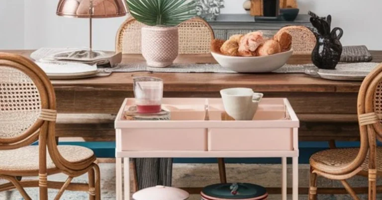
5. Dusty Rose

A warm, muted pink-beige hybrid. Dusty rose adds a soft, contemporary feel to kitchens.
It’s often used on lower cabinets or in decorative touches like barstools and lighting fixtures.
This tone pairs well with marble countertops and brushed gold accents.
6. Black-Blue

Deeper than navy but not quite black. This color is excellent for cabinetry because it adds depth without going full gothic.
Works great with matte finishes and looks sharp when contrasted with white or pale wood.
7. Greige (Gray + Beige)

This color is still trending thanks to its versatility.
Greige is a go-to neutral for open floor plans because it connects kitchens to adjacent living spaces seamlessly.
Choose a warm undertone to keep the space from feeling sterile.
8. Pale Terracotta

Pale terracotta brings warmth without heaviness. It has the grounding nature of earthy tones but stays light enough for small kitchens.
Great on walls or in decorative tilework. Works well with stainless steel and natural wood.
9. Forest Green

Forest green is a cooler tone than moss, ideal for full cabinetry or accent walls.
It’s especially popular in high-contrast kitchens with white marble countertops and gold or brass hardware. Think bold but classic.
10. Bubblegum Pink

While risky, this color adds charm when used sparingly. Ideal for a single feature like a pantry door or kitchen island.
When paired with neutrals or stainless steel, it creates a surprising modern twist.
11. Warm Taupe

Warm taupe is a mid-range neutral that reflects light well, making it a good choice for small or low-light kitchens.
It works across multiple design styles and combines well with both warm and cool accents.
12. Stainless Steel Gray

Industrial and sleek. This tone is most effective in minimalist kitchens with slab cabinetry and concrete or quartz surfaces.
Best used in urban or modern environments. It pairs well with glass and metal finishes.
13. Creamy White

A long-standing favorite. The trend now leans toward whites with warm undertones like ivory or bone.
These shades avoid the harsh glare of pure white and create a softer, more inviting atmosphere.
14. Blanched Wood Tones

Light woods like ash and white oak are big in 2025. These aren’t painted finishes but rather stains and natural treatments.
They add warmth and texture and work with nearly every color palette.
15. Charcoal Green

A moody, muted hybrid that hovers between black and green.
It’s elegant and best used in kitchens with flat-panel cabinets and minimal ornamentation.
Good lighting is essential here to avoid making the space feel too dark.
16. High-Gloss Green

Reflective and bold. High-gloss emerald or bottle green is making waves in modern kitchen design.
This is not a subtle look. Best for designers or homeowners who want something eye-catching. Requires good lighting and quality finishes.
17. Warm Beige

This is beige upgraded. Less dull, more golden. Pairs well with wood, stone, and other natural materials.
Great for full cabinetry or open shelving. Adds a grounded feel without the flatness of old-school beige.
18. Ocean Blue-Gray

Calm, quiet, and subtly colorful. This tone fits best in coastal or transitional kitchens.
Pairs beautifully with white quartz, rattan, or brushed nickel. It maintains a fresh feeling without being overly crisp.
19. Yellow-Based Creams

This shade sits between white and beige, with a noticeable yellow undertone.
It works on walls, trim, cabinetry, and ceilings. Ideal for vintage or country-style kitchens. Helps reflect natural light while warming up the space.
20. Matte Black

Bold and dramatic. Matte black is increasingly used in cabinetry, islands, and even ceiling beams.
It provides visual weight and contrast. Downside? It shows fingerprints and dust. Keep cleaning supplies nearby.
21. Mushroom

A chameleon of a color—part brown, part gray, sometimes with a hint of lavender.
Mushroom works across styles and lighting conditions. You can do full-wall mushroom or just the cabinets. It’s flexible.
22. Glossy Navy

Navy’s shiny new sibling. Glossy navy is darker, deeper, and much more reflective.
Works great with chrome hardware and white countertops. Adds a touch of polish to a traditional favorite.
23. Brushed Copper Accents

Not a wall color, but important to mention.
Copper accents—especially brushed finishes—are showing up in hoods, hardware, and pendant lights.
They add warmth and contrast, especially in kitchens with cooler palettes.
Why This Matters
Colors aren’t just aesthetic. They affect how light behaves in your kitchen. How clean it looks.
How it feels in the morning or at night. A bright yellow backsplash might be energizing in theory, but under LED light, it can go sickly.
That forest green island? Gorgeous under a skylight but heavy in a poorly lit corner. This is why undertone matters.
Why material finish (matte vs. gloss) matters. And why context is everything.
Common Mistakes
- Picking trendy colors in the wrong finish. A great shade in high-gloss might look tacky; the same in matte could be perfect.
- Forgetting how lighting changes everything. Natural light, warm bulbs, cold fluorescents—they all shift the look.
- Using bold colors without balancing neutrals.
- Choosing paint without testing it in your actual kitchen.
What To Do Instead
- Test colors on site. Paint samples directly onto cabinets or wall areas.
- Consider the material. Paint behaves differently on wood vs. laminate vs. drywall.
- Use bold colors for accents, not full rooms—unless you have the light and space.
- Keep finish in mind. Gloss reflects. Matte absorbs. Satin does both.
Final Word
2025’s kitchen colors are pushing further into natural territory—not just in theme, but in tone and texture. Think grounded. Think saturated.
Think human. There’s less fear around color now. But that doesn’t mean throwing it everywhere. The smartest kitchens are editing carefully. Using bold where it counts. And choosing colors that age well.
That’s what makes these 23 ideas more than trends. They’re smart, practical tools you can actually use.


