Kitchen Color Blue Makeovers: 23 Blue Hues to Try This Year
This post is all about Kitchen Color Blue makeover.

Blue is a versatile and timeless choice for kitchen makeovers, offering a spectrum of shades that can suit any style or mood.
From soothing light tones to bold, dramatic hues, blue brings a sense of calm, sophistication, and creativity to the heart of the home.
Why Blue Works So Well in the Kitchen
Before jumping into the list, let’s take a moment to understand why blue is a go-to color for modern kitchen makeovers.
Blue tones—ranging from soft sky shades to rich navy—can set a calm, clean, and refreshing atmosphere in a space that’s often buzzing with activity.
It’s a color that adapts easily—equally beautiful in contemporary, coastal, farmhouse, or even minimalist kitchen styles.
23 Blue Hues to Try This Year
This article explores 23 stunning blue hues that can transform a kitchen into a welcoming and stylish space.
Each shade comes with detailed ideas and practical advice to inspire homeowners looking to refresh their cooking area.
Whether painting cabinets, updating a backsplash, or adding subtle accents, these blue hues provide endless possibilities.
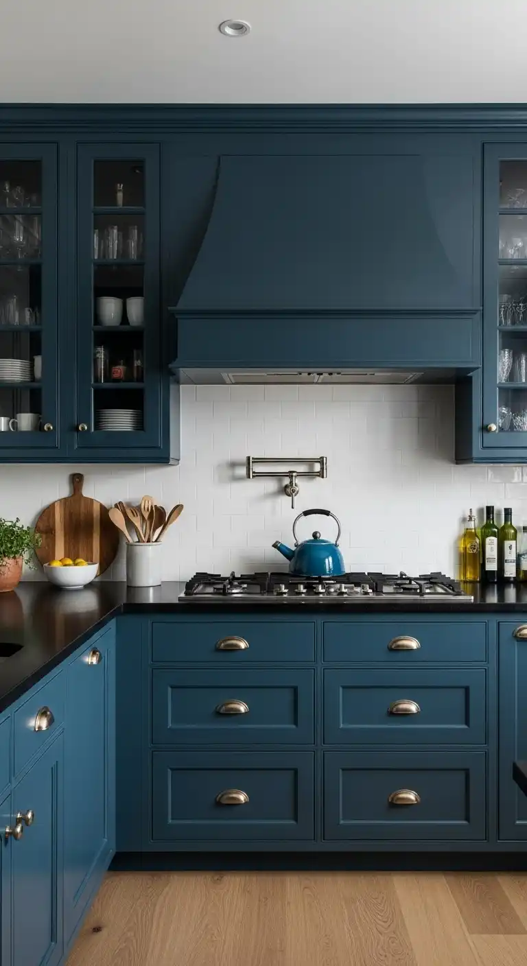
1. Navy Blue

Navy blue is a deep, rich shade that adds a touch of elegance and depth to any kitchen.
Try This
Paint the lower cabinets navy blue while keeping upper cabinets white for a striking contrast.
Alternatively, use navy blue tiles to create a bold backsplash that anchors the room.
Tips
Ensure ample lighting to avoid a cave-like feel, and pair with brass or gold hardware for a luxurious touch.
Test the shade on a small area first, like an island, to gauge its impact.
Why It Works
Navy blue creates a cozy, intimate atmosphere, ideal for larger kitchens.
Its timeless appeal suits both modern and traditional designs, making it a lasting choice.
Interior designers often note that homeowners who choose navy blue feel a sense of sophistication in their space.
The color’s versatility allows it to blend with various textures, like wood or marble, enhancing the kitchen’s overall aesthetic.
2. Sky Blue

Sky blue is a light, airy hue that brings a fresh and open feel to the kitchen.
Try This
Paint the walls sky blue to visually expand the space, or use it on cabinet interiors with glass doors for a subtle pop of color.
Tips
Pair with white or light gray to keep the kitchen bright, and balance with warm accents like wooden shelves.
Consider the room’s lighting, as it may appear cooler in dim conditions.
Why It Works
This shade makes small kitchens feel larger and promotes tranquility, perfect for a busy household.
Its soft tone complements a variety of styles, from minimalist to coastal.
Experts find that sky blue often lifts the mood of those who cook, creating a serene backdrop for daily tasks.
It pairs beautifully with natural light, enhancing the kitchen’s welcoming vibe.
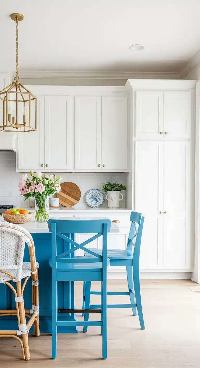
3. Teal

Teal, a vibrant mix of blue and green, injects energy and personality into the kitchen.
Try This
Use teal to paint the kitchen island as a standout feature, or incorporate it through patterned tiles on the floor or walls.
Tips
Balance teal with neutral tones like beige to avoid overwhelming the space.
Repeat the color in small accents, such as dishware, for cohesion.
Why It Works
Teal adds a playful yet sophisticated touch, fitting modern and eclectic kitchens alike.
Its bold nature energizes the room without overpowering it.
Design professionals observe that teal often sparks creativity in homeowners, making it ideal for those who love experimenting with recipes.
Its unique blend of hues ensures it stands out while remaining versatile.
4. Turquoise

Turquoise is a bright, cheerful shade that evokes a tropical, uplifting atmosphere.
Try This
Paint upper cabinets turquoise for a lively twist, or create a statement with a turquoise backsplash using geometric tiles.
Tips
Combine with natural wood for warmth, and keep countertops simple to let the color shine.
A matte finish can soften its vibrancy if needed.
Why It Works
Turquoise infuses joy and positivity, making it perfect for social kitchens.
Its brightness thrives in well-lit spaces, enhancing the room’s energy.
Homeowners often report that turquoise kitchens feel like a breath of fresh air, reminiscent of serene getaways.
It’s a bold yet approachable choice for a standout makeover.
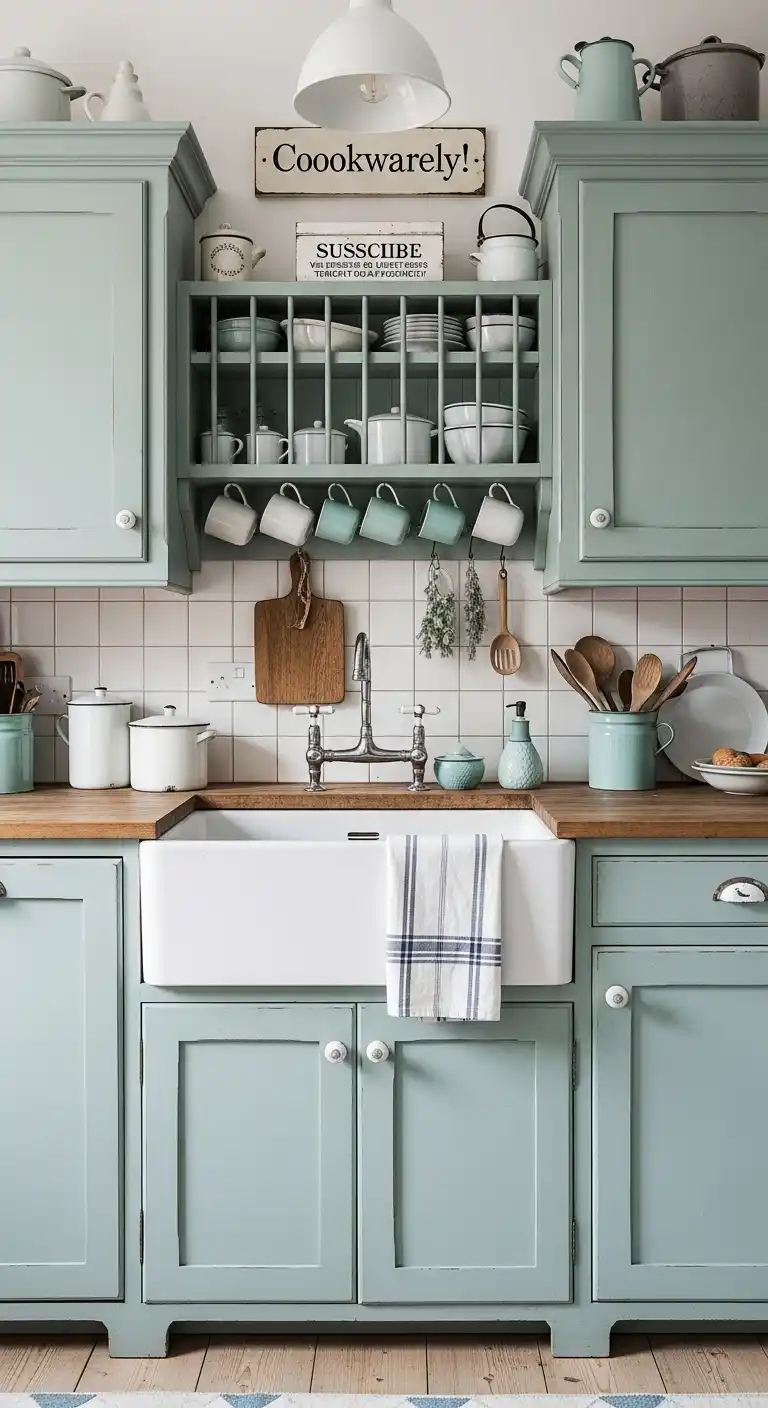
5. Powder Blue

Powder blue is a soft, muted shade that offers timeless elegance with a gentle touch.
Try This
Paint all cabinets powder blue for a cohesive, calming look, or use it on the ceiling to subtly elevate the space.
Tips
Pair with marble countertops for sophistication, and add texture with shiplap or woven rugs.
Avoid overly dark accents to maintain its lightness.
Why It Works
This hue suits vintage or farmhouse kitchens, creating a soothing environment.
Its understated charm makes it a versatile backdrop for decor.
Interior experts note that powder blue often evokes nostalgia, appealing to those who cherish classic designs.
Its subtlety ensures it remains elegant over time.
6. Cobalt Blue

Cobalt blue is a vivid, intense shade that demands attention and adds drama.
Subscribe to Cookwarely
Get updates on the latest posts and more from Cookwarely straight to your inbox.
Try This
Paint a feature wall or the kitchen island cobalt blue, or use it in accessories like pendant lights for a bold accent.
Tips
Use sparingly to avoid overpowering the space, and pair with white to temper its strength.
Glossy finishes can enhance its modern appeal.
Why It Works
Cobalt blue brings energy and luxury, elevating even simple kitchens.
Its striking tone makes it a focal point in any design.
Designers find that homeowners who choose cobalt blue enjoy the confidence it exudes.
It’s a perfect pick for those unafraid of bold statements.
7. Royal Blue

Royal blue is a deep, regal hue that blends classic charm with contemporary flair.
Try This
Paint cabinets royal blue and add gold hardware for a luxurious look, or use it on a tiled backsplash for impact.
Tips
Incorporate reflective surfaces to keep the space bright, and limit to key areas for balance.
Test in different lights to ensure the desired effect.
Why It Works
Royal blue adds grandeur and versatility, fitting various styles seamlessly.
Its depth creates a rich, inviting atmosphere.
Experts often see royal blue chosen by those seeking a balance of tradition and modernity.
It elevates the kitchen’s status as a central gathering spot.
8. Baby Blue

Baby blue is a gentle, soothing shade that fosters peace and relaxation.
Try This
Use baby blue on walls or cabinets for a soft glow, or paint cabinet interiors for a delicate surprise.
Tips
Pair with warm neutrals like cream to avoid a chilly feel, and add texture with linen or wood.
Keep lighting soft for harmony.
Why It Works
This hue calms the kitchen, ideal for unwinding.
Its light tone brightens spaces, making it great for smaller areas.
Homeowners frequently find baby blue creates a restful retreat, perfect for morning routines.
Its simplicity enhances the room’s comfort.
9. Periwinkle

Periwinkle, a blend of blue and lavender, offers a whimsical, romantic vibe.
Try This
Paint the island periwinkle for a soft focal point, or use it on trim or shelving for a subtle lift.
Tips
Balance with white or wood tones, and add botanical elements for cohesion.
Avoid heavy contrasts to preserve its charm.
Why It Works
Periwinkle adds a unique, feminine touch, ideal for eclectic kitchens.
Its gentle purple undertones make it stand out subtly.
Designers note that periwinkle often appeals to those seeking a personal, creative space.
It’s a fresh take on traditional blue.
10. Cerulean

Cerulean is a bright, clear blue that feels crisp and invigorating.
Try This
Paint upper cabinets cerulean for an airy feel, or use it in a rug or curtains for a bold accent.
Tips
Pair with white to enhance its freshness, and mix in patterns like stripes for interest.
Matte finishes can soften its intensity.
Why It Works
Cerulean opens up the kitchen, suiting coastal or modern designs.
Its brightness energizes without overwhelming.
Experts find cerulean often chosen for its uplifting quality, making kitchens feel vibrant and alive.
It thrives in light-filled spaces.
11. Denim Blue

Denim blue is a casual, muted shade that feels comfortable and approachable.
Try This
Paint lower cabinets denim blue with butcher block counters, or use it on a shiplap wall for texture.
Tips
Add matte finishes for a relaxed look, and contrast with black hardware.
Incorporate natural fibers for warmth.
Why It Works
This hue fits farmhouse or cottage kitchens, creating a laid-back vibe.
Its versatility blends with many palettes.
Homeowners often enjoy denim blue’s easygoing nature, mirroring a favorite pair of jeans.
It’s practical yet stylish.
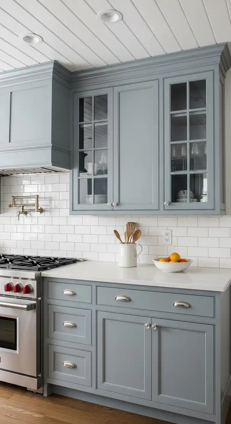
12. Slate Blue

Slate blue is a grayish-blue shade that feels modern and sophisticated.
Try This
Use slate blue on cabinets for a sleek look, or paint the ceiling for a subtle twist.
Tips
Pair with concrete or quartz for an industrial edge, and add wood for warmth.
Keep accents minimal for focus.
Subscribe to Cookwarely
Get updates on the latest posts and more from Cookwarely straight to your inbox.
Why It Works
Slate blue offers a neutral yet colorful base, perfect for contemporary kitchens.
Its muted tone adapts to trends.
Designers see slate blue favored for its understated elegance, appealing to minimalist tastes.
It’s a chic, timeless pick.
13. Indigo

Indigo is a deep, inky blue that adds mystery and luxury to the kitchen.
Try This
Paint the island indigo for a dramatic centerpiece, or use it on a custom hood for flair.
Tips
Balance with bright lighting and metallics, and echo in textiles for unity.
Use sparingly in small spaces.
Why It Works
Indigo creates intimacy and opulence, enhancing larger kitchens.
Its richness elevates the design.
Experts note indigo often suits those who crave a bold, moody aesthetic.
It’s a statement hue with depth.
14. Aqua

Aqua is a light, playful shade that brings youthful energy to the kitchen.
Try This
Use aqua for backsplash tiles or open shelving, or paint an appliance for a retro vibe.
Tips
Pair with white or wood to keep it fresh, and add patterns for fun.
Avoid overuse to maintain balance.
Why It Works
Aqua adds cheer and liveliness, great for family kitchens.
Its vibrancy suits creative spaces.
Homeowners find aqua sparks joy, reminiscent of carefree days.
It’s a bold yet friendly choice.
15. Robin’s Egg Blue

Robin’s egg blue is a pale, greenish-blue that feels vintage and delicate.
Try This
Paint cabinets robin’s egg blue with vintage hardware, or use it on a beadboard backsplash.
Tips
Add glass-front cabinets for charm, and pair with antiques for character.
Keep accents light for harmony.
Why It Works
This shade evokes nostalgia, fitting cottage kitchens.
Its softness creates a cozy feel.
Designers see it chosen for its timeless appeal, offering a gentle, lived-in look.
It’s subtly distinctive.
16. Midnight Blue

Midnight blue is a dark, sleek shade that feels modern and bold.
Try This
Use midnight blue on lower cabinets with marble tops, or paint the ceiling for drama.
Tips
Add task lighting to brighten the space, and use texture for depth.
Pair with neutrals for balance.
Why It Works
Midnight blue adds sophistication, ideal for minimalist designs.
Its depth highlights other elements.
Experts find it popular among those seeking a contemporary edge.
It’s striking yet refined.
17. Cornflower Blue
Cornflower blue is a bright, cheerful shade that feels warm and inviting.
Try This
Paint upper cabinets cornflower blue, or use it in lighting or seating for a pop.
Tips
Pair with wicker or rattan for a casual feel, and add florals for charm.
Keep it light with white accents.
Why It Works
This hue uplifts the kitchen, suiting social spaces.
Its medium tone balances boldness and ease.
Homeowners enjoy its optimistic vibe, making kitchens feel friendly.
It’s a versatile, happy choice.
18. Steel Blue

Steel blue is a cool, industrial shade that feels edgy and modern.
Try This
Use steel blue on cabinets with stainless steel, or add it to shelving for a raw look.
Tips
Soften with warm lighting or wood, and mix in metallics for interest.
Keep lines clean for focus.
Why It Works
Steel blue suits urban kitchens, offering a sleek base.
Its muted tone is subtly striking.
Designers note its appeal to those who love industrial chic.
Subscribe to Cookwarely
Get updates on the latest posts and more from Cookwarely straight to your inbox.
It’s a practical, stylish pick.
19. Sapphire Blue

Sapphire blue is a rich, jewel-toned shade that feels luxurious and vibrant.
Try This
Paint the island sapphire blue, or use it in a dining nook for a regal touch.
Tips
Balance with neutral walls, and add glass fixtures for glamour.
Use in key areas for impact.
Why It Works
Sapphire blue elevates the kitchen with opulence.
Its vibrancy makes it a standout choice.
Experts see it chosen for its bold luxury, appealing to statement-makers.
It’s a gem of a hue.
20. Ice Blue

Ice blue is a pale, crisp shade that feels clean and minimalist.
Try This
Use ice blue on walls or cabinets for a subtle lift, or paint trim for a fresh detail.
Tips
Add soft textiles for warmth, and pair with whites for harmony.
Avoid dark accents to keep it airy.
Why It Works
Ice blue suits modern kitchens, enhancing brightness.
Its cool tone feels serene and open.
Homeowners find it creates a calm, uncluttered space.
It’s perfect for simplicity lovers.
21. Duck Egg Blue
Duck egg blue is a muted, greenish shade that feels vintage and cozy.
Try This
Paint cabinets duck egg blue and distress them, or use it on a sink apron for charm.
Tips
Pair with vintage finds like enamelware, and add wood for warmth.
Keep it light with soft accents.
Why It Works
This hue fits shabby chic kitchens, offering a lived-in feel.
Its softness is comforting.
Designers note its nostalgic appeal, ideal for rustic lovers.
It’s a gentle, unique blue.
22. Prussian Blue
Prussian blue is a deep, intense shade with green undertones, perfect for drama.
Try This
Use Prussian blue on lower cabinets with dark counters, or paint the whole kitchen for impact.
Tips
Add bright lighting to balance its depth, and use wood for warmth.
Limit in small spaces.
Why It Works
Prussian blue creates a moody, intimate vibe, great for bold designs.
Its richness intrigues.
Experts find it suits those who love a dark, artistic look.
It’s a powerful, mysterious choice.
23. Wedgewood Blue
Wedgewood blue is a medium, grayish shade that feels classic and refined.
Try This
Paint cabinets Wedgewood blue with subway tile, or use it on a paneled ceiling.
Tips
Add crystal knobs for elegance, and pair with molding for depth.
Keep accents subtle for focus.
Why It Works
This hue suits timeless kitchens, offering understated charm.
Its gray tones add sophistication.
Homeowners enjoy its refined yet approachable feel, blending old and new.
It’s elegantly versatile.
Tips for Choosing the Right Blue for Your Kitchen
Before diving into the ideas, here are a few practical pointers to help you narrow down the perfect shade:
- Natural Light Matters: Kitchens with lots of sunlight can carry darker blues without feeling heavy. If your space is dim or enclosed, lighter blues like robin’s egg or powder blue will open it up.
- Pair with the Right Finishes: Blue works well with white, gold, brass, and even wood accents. Test color swatches next to your cabinetry, flooring, and appliances to avoid clashes.
- Test in Real Light: Always test paint or tile samples in your actual kitchen lighting—day and night. What looks like a soft gray-blue on a color card might turn purple under LED lighting.
Conclusion
Blue offers endless possibilities for kitchen makeovers, from calming pastels to striking deep tones.
Homeowners can start small with accents or go bold with full cabinetry updates.
Consider the kitchen’s lighting and size when selecting a shade, and test samples to ensure the perfect fit.
Pairing blue with complementary textures and colors enhances its impact.
With these 23 hues, anyone can create a kitchen that’s both functional and beautiful.
FAQs
What blue works best for small kitchens?
Light shades like sky blue or ice blue can make tight spaces feel larger and airier.
Can dark blues work in low-light kitchens?
Yes, with ample artificial lighting and reflective surfaces to brighten the area.
How can one pick the right blue?
Evaluate the kitchen’s natural light and existing colors, then test shades in small areas first. Check out how to choose kitchen colors for more guidance.
What pairs well with blue in kitchens?
Blue complements white, wood tones, and metallics, creating balanced, stylish combos. Explore kitchen color combos for inspiration.