17 Eye-Catching Kitchen Color Combos for a Stylish Home
This post is all about Kitchen Color Combos.
Choosing the right color combination can transform a kitchen from ordinary to attractive and inviting.
A well-selected palette enhances the overall style and atmosphere of the home without requiring a complete remodel.
This article highlights 17 color combos that offer practical and stylish options for various tastes and kitchen designs.
🎄 Christmas & Year-End Amazon Deals !
Don’t miss out on the best discounts and top-rated products available right now!
*As an Amazon Associate, I earn from qualifying purchases.
These choices help homeowners make informed decisions when refreshing their kitchen’s look.
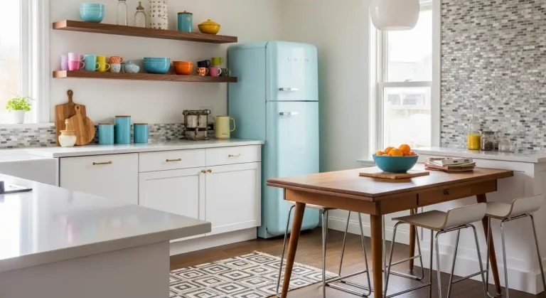
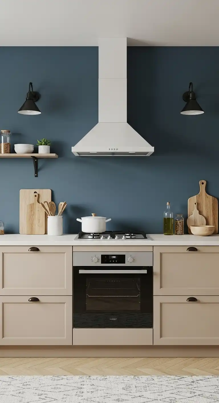
1) Navy Blue and Crisp White
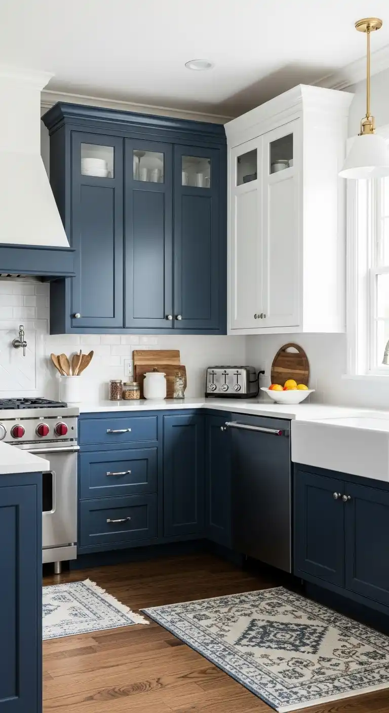
Navy blue and crisp white create a timeless kitchen color combination. The deep blue adds depth, while the white brightens the space with contrast.
This pairing works well on cabinets and walls, offering a balanced and clean look. It suits both modern and traditional kitchen styles, making it versatile.
Navy and white can be complemented with metallic or wood accents to add warmth or shine.
2) Charcoal Gray and Mustard Yellow
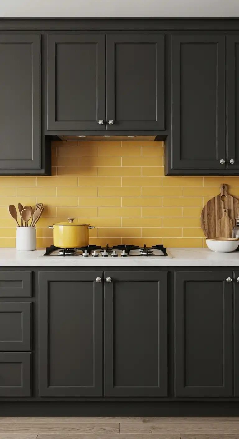
Charcoal gray provides a solid, modern base for any kitchen. It creates a calm and neutral backdrop that pairs well with many accent colors.
Mustard yellow adds warmth and energy without overwhelming the space. It acts as a bold contrast to the gray, offering brightness and a touch of vintage flair.
Together, the two colors balance sophistication and vibrancy. This combination works well in cabinets, backsplashes, or accessories, giving a stylish yet approachable look.
3) Emerald Green and Soft Pink
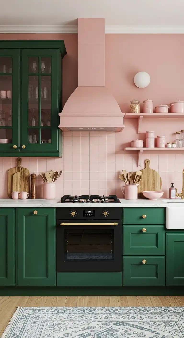
Emerald green paired with soft pink creates a balanced and inviting kitchen color scheme.
The deep richness of emerald adds depth, while the soft pink introduces warmth without being overpowering.
This combination works well on cabinets and walls or as accent colors in accessories and backsplashes.
It suits both modern and traditional kitchen styles, offering a fresh yet refined look.
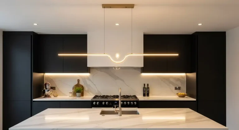
4) Matte Black and Warm Wood
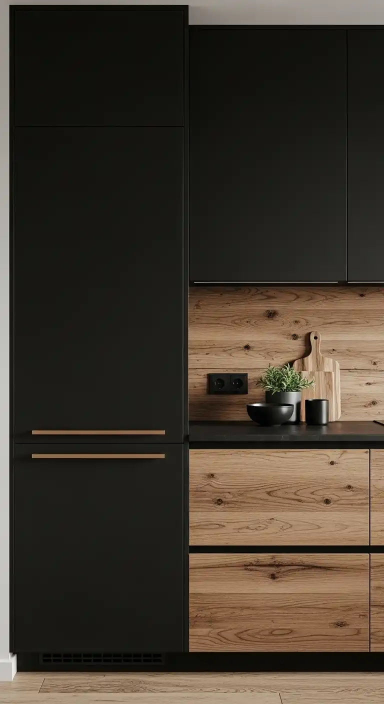
Matte black paired with warm wood creates a balanced, modern look.
The black adds depth and sleekness while the wood introduces natural warmth and texture.
This combination works well for cabinetry, countertops, or furniture. It is versatile and fits both contemporary and rustic styles.
🎄 Christmas & Year-End Amazon Deals !
Don’t miss out on the best discounts and top-rated products available right now!
*As an Amazon Associate, I earn from qualifying purchases.
Using matte black with warm wood can make a kitchen feel grounded yet sophisticated. It avoids the coldness sometimes found in all-black designs.
5) Terracotta and Sage Green
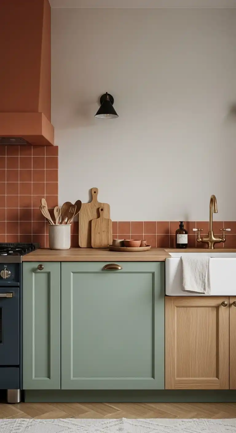
Terracotta and sage green create a grounded, natural color combination.
The warm, earthy tones of terracotta balance well with the soft, muted green of sage.
This pairing brings a calm, organic vibe to the kitchen. It works well with natural materials like wood and stone.
Together, they add subtle depth without overwhelming the space.
6) Blush Pink and Cream
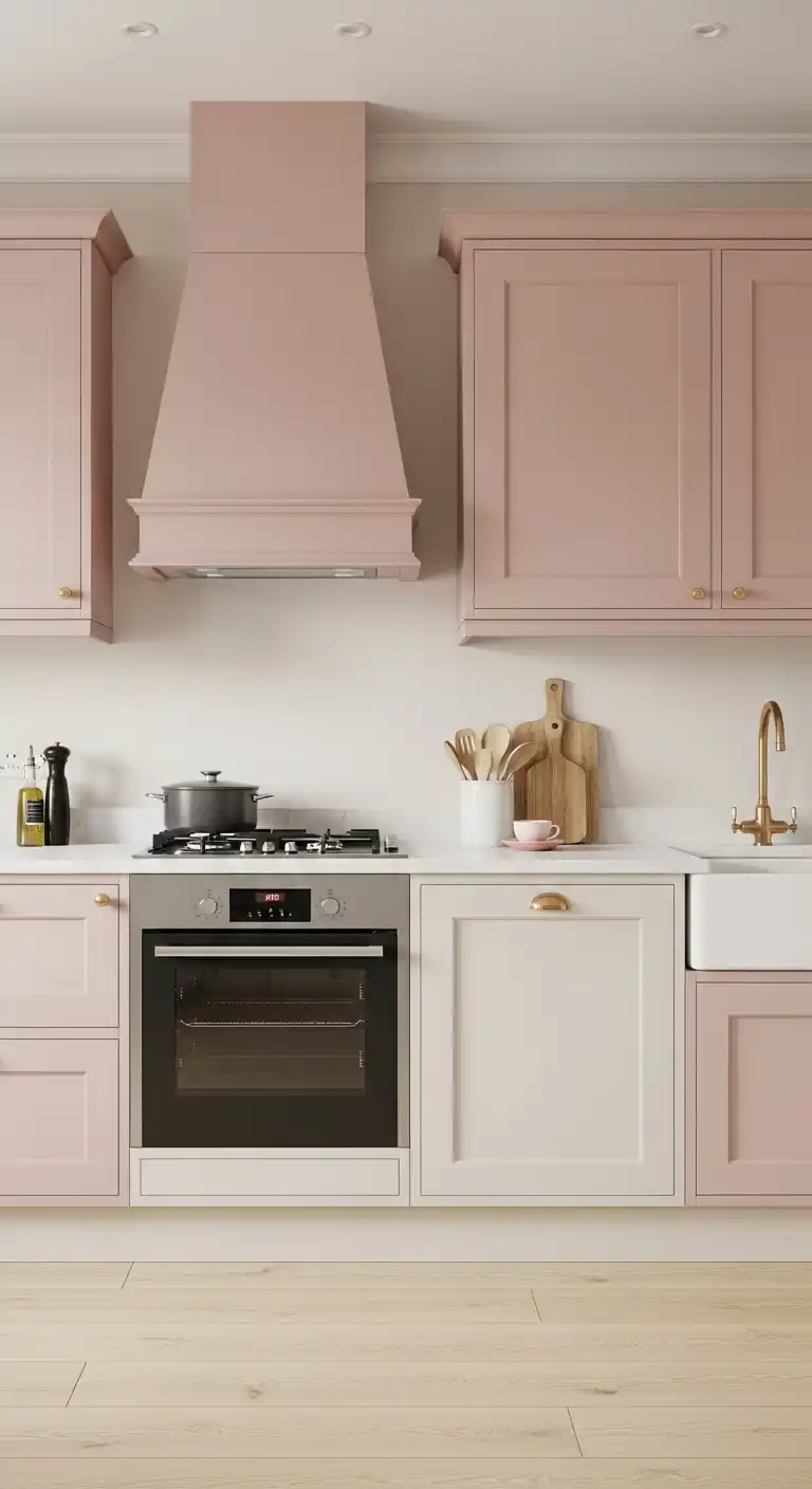
Blush pink and cream create a soft, calming atmosphere in the kitchen. The combination offers warmth without overwhelming the space.
Blush pink works well on cabinets or accents. Cream balances it by providing a neutral, light backdrop.
This pairing suits both modern and traditional styles. It adds subtle color while maintaining elegance and simplicity.
7) Turquoise and Coral
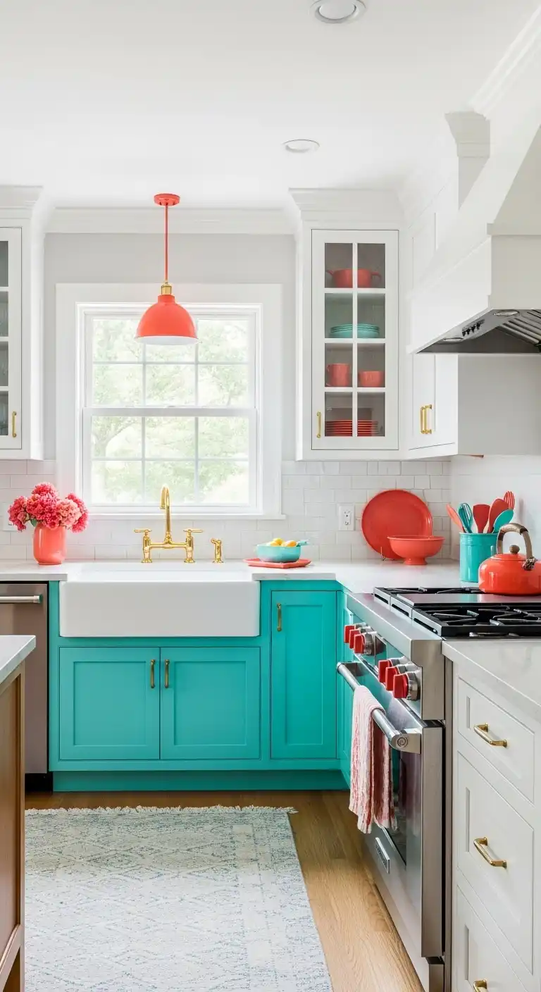
Turquoise and coral create a vibrant yet balanced kitchen palette. The coolness of turquoise contrasts well with the warm, energetic tones of coral.
This combination works best with neutral elements like white or light wood. It adds personality without overwhelming the space.
Designers often use turquoise for cabinetry and coral as accent colors in accessories or backsplashes.
The duo can enliven both modern and coastal kitchen styles.
🎄 Christmas & Year-End Amazon Deals !
Don’t miss out on the best discounts and top-rated products available right now!
*As an Amazon Associate, I earn from qualifying purchases.
8) Lavender and Light Gray
Lavender paired with light gray creates a calm and inviting kitchen atmosphere. The soft purple hue adds a subtle pop of color without overwhelming the space.
Light gray acts as a neutral backdrop, balancing the warmth of lavender. Together, they offer a modern and elegant look suitable for various kitchen styles.
This combo works well with white cabinetry or stainless steel appliances, enhancing a clean and airy feel.
It is ideal for those who prefer color without strong contrasts.
9) Burnt Orange and Teal
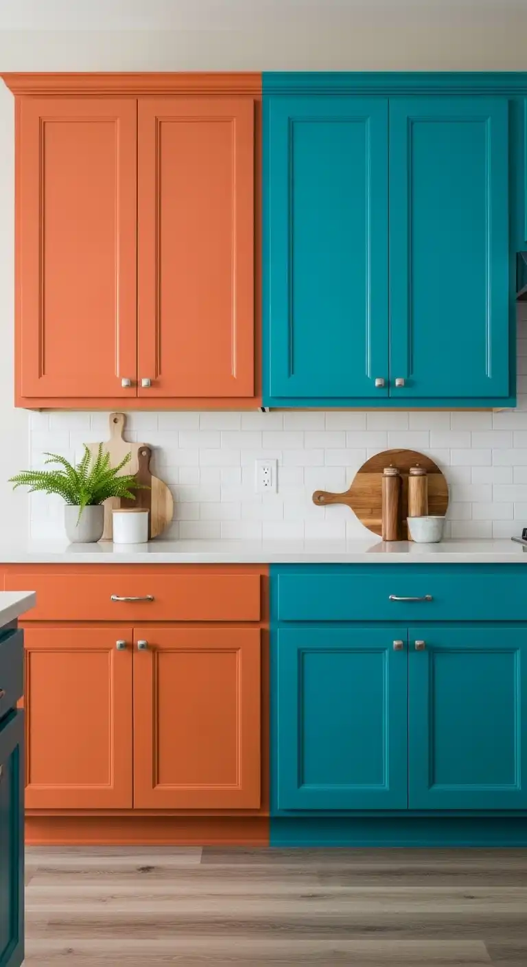
Burnt orange paired with teal creates a bold yet balanced kitchen palette.
The warmth of burnt orange contrasts with the coolness of teal, delivering a dynamic look.
This combination works well on cabinets or accent walls. It brings energy without overwhelming the space.
Using neutral tones alongside these colors helps to keep the kitchen grounded. The result is a vibrant yet harmonious environment.
10) Classic Red and White
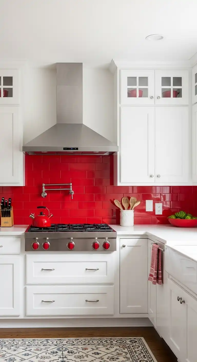
Red and white is a timeless kitchen color combination. The boldness of red contrasts sharply with clean white surfaces, creating a vibrant yet balanced space.
This pair works well with both modern and traditional styles. White cabinets paired with red backsplashes or accents can brighten the room while adding energy.
The combination is versatile and can be adjusted with different shades of red or finishes to suit taste and lighting.
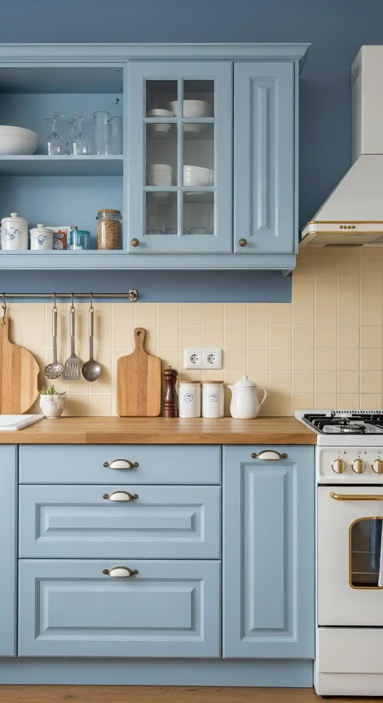
11) Steel Blue and Beige
Steel blue offers a cool, calming presence in the kitchen. It pairs well with beige, which brings warmth and softness to the space.
🎄 Christmas & Year-End Amazon Deals !
Don’t miss out on the best discounts and top-rated products available right now!
*As an Amazon Associate, I earn from qualifying purchases.
This combination balances modern and classic vibes, making the kitchen feel inviting yet contemporary.
Beige cabinets or countertops work well against steel blue walls or backsplashes.
The colors complement each other without competing for attention.
12) Olive Green and Copper
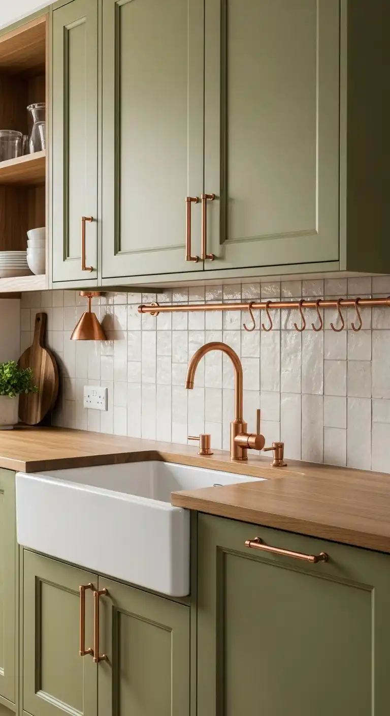
Olive green pairs well with copper for a warm, sophisticated look. The muted earthiness of olive green balances the metallic shine of copper accents.
This combination works well in kitchens with natural materials like wood or stone.
Copper handles, light fixtures, or backsplash tiles add subtle elegance without overpowering the space.
Together, olive green and copper create a timeless design that feels both modern and grounded.
13) Powder Blue and Pale Yellow
Powder blue and pale yellow create a soft, inviting atmosphere in the kitchen.
This combination balances cool and warm tones, making the space feel fresh yet cozy.
It works well on walls, cabinetry, or accents like tiles and accessories. Together, these colors add subtle contrast without overwhelming the senses.
14) Chocolate Brown and Sky Blue
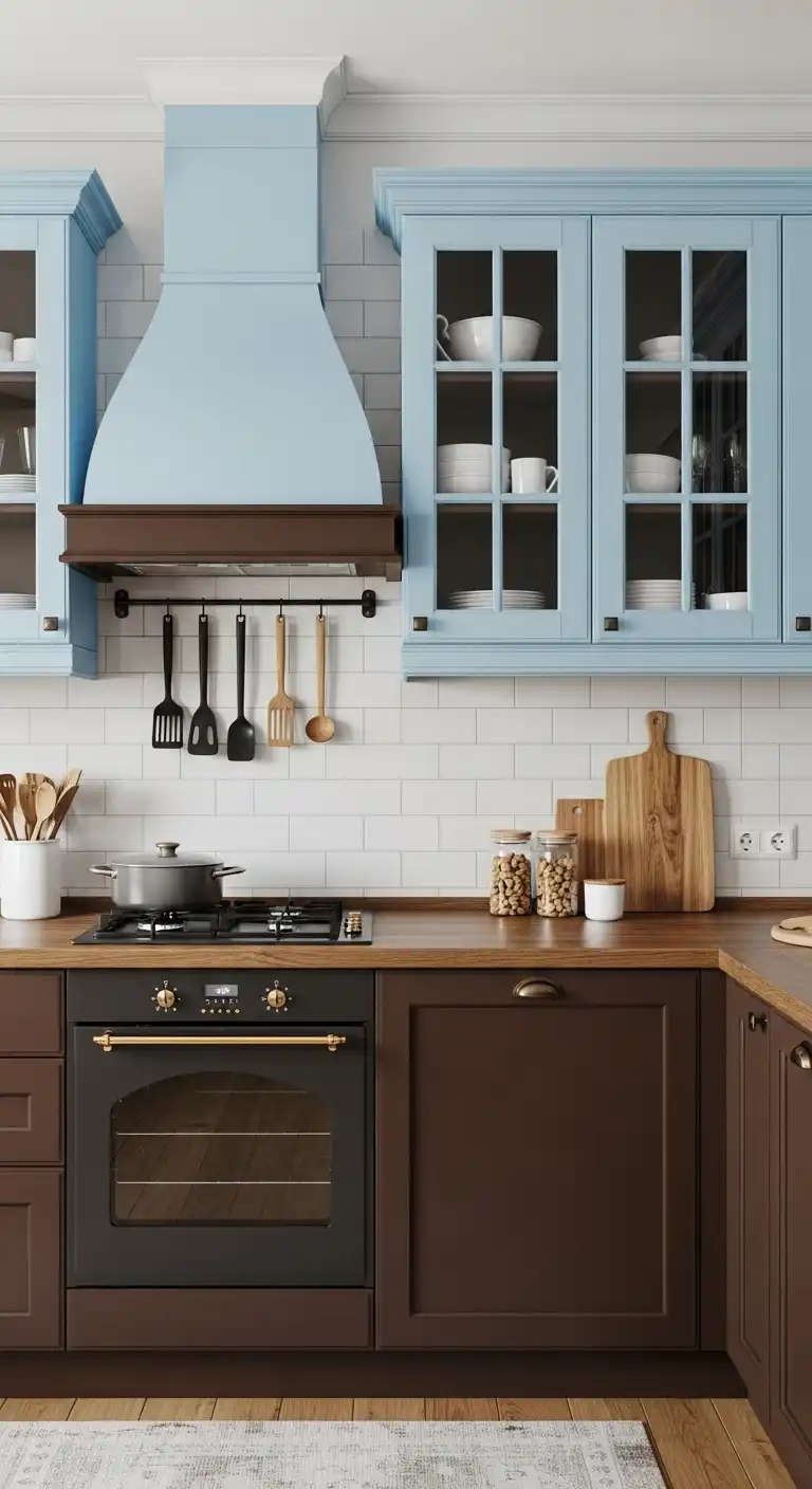
This color combo balances warmth and freshness in the kitchen. Chocolate brown adds depth and richness, grounding the space with its dark, earthy tone.
Sky blue introduces a light, airy feel that contrasts well with brown’s heaviness. Together, they create a calm yet inviting atmosphere.
🎄 Christmas & Year-End Amazon Deals !
Don’t miss out on the best discounts and top-rated products available right now!
*As an Amazon Associate, I earn from qualifying purchases.
The combination works well for cabinets and walls, or accessories paired with wooden countertops. It suits both modern and rustic kitchen styles.
15) Mint Green and Charcoal
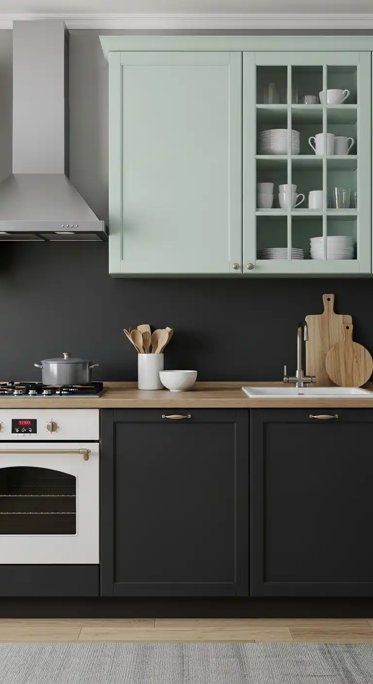
Mint green paired with charcoal creates a balanced and modern kitchen palette.
The soft, refreshing tone of mint green contrasts well with the deep, grounding presence of charcoal.
This combo offers a subtle yet stylish look, suitable for both traditional and contemporary designs.
It works well on cabinets, walls, and accents, bringing a calm but defined atmosphere to the space.
16) Gold Accents with Deep Plum
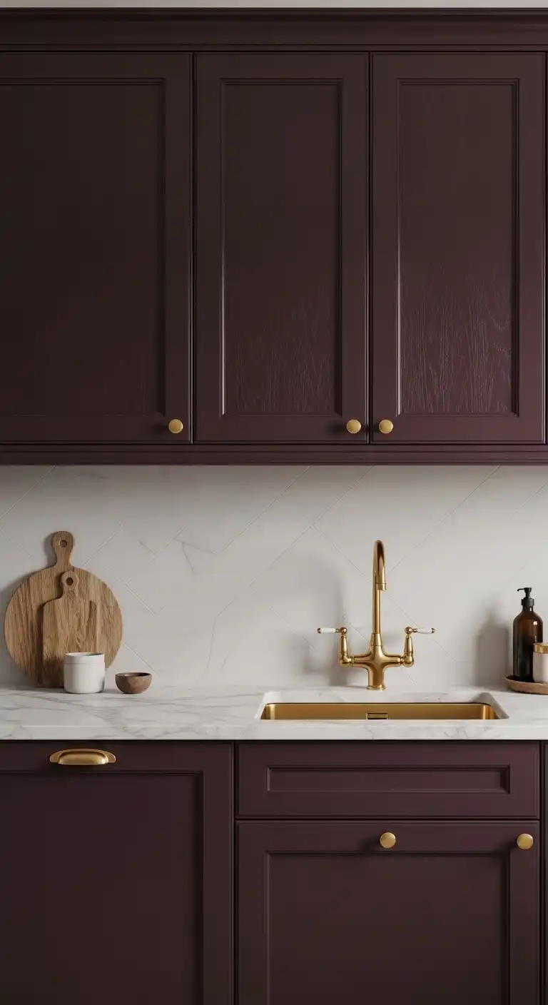
This combination pairs the richness of deep plum with the warmth of gold accents.
Deep plum adds depth and sophistication to kitchen walls or cabinetry.
Gold hardware and fixtures provide a subtle shine that enhances the overall look without overpowering.
The contrast creates a balanced, elegant atmosphere in the space. It works well in both modern and traditional kitchen designs.
17) Soft Lilac and Navy
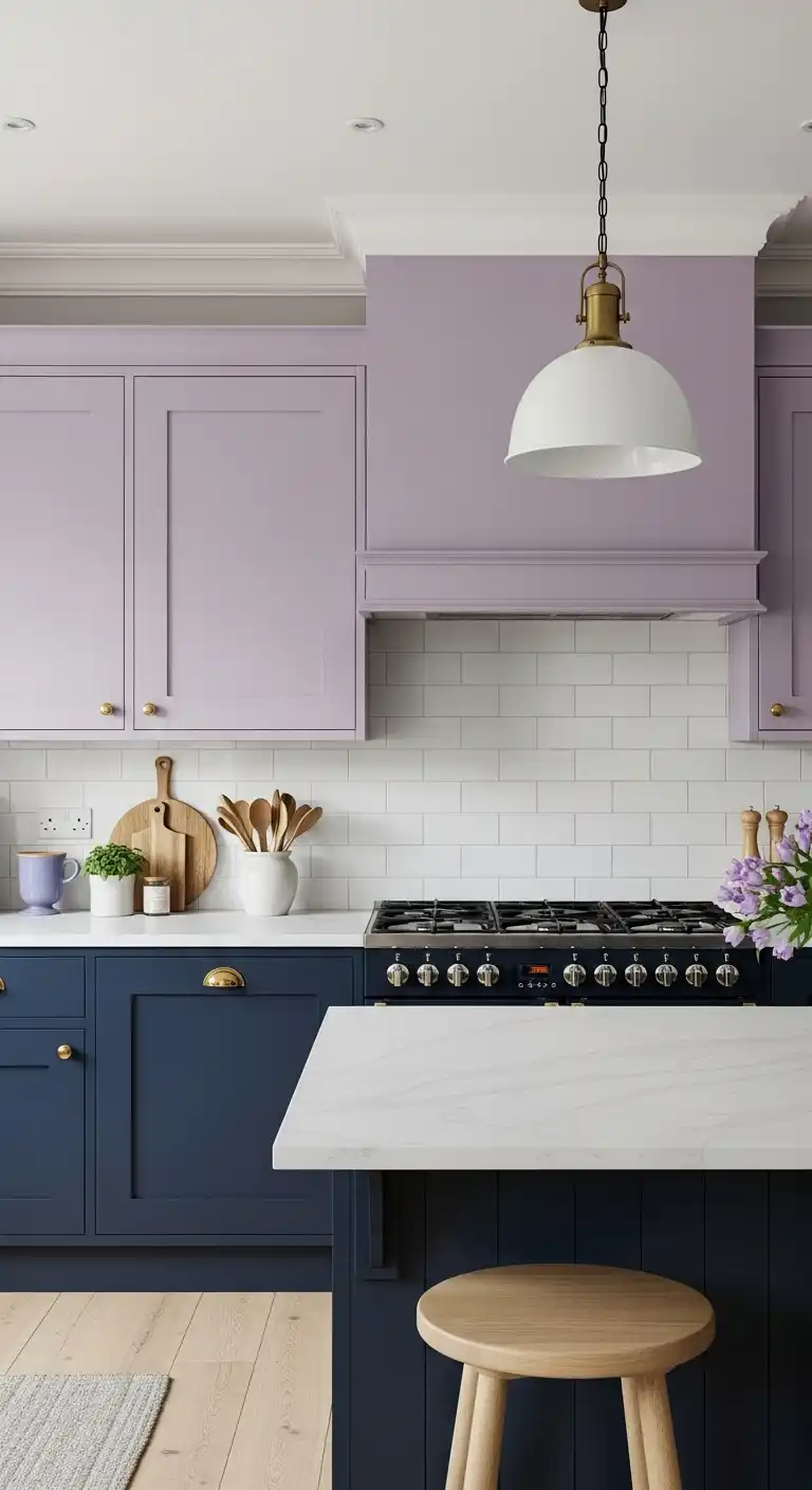
Soft lilac paired with navy creates a balanced, calm kitchen palette. The gentle hue of lilac adds a subtle warmth.
Navy provides a deep contrast that grounds the space without overwhelming it. This combination works well on walls, cabinetry, or accents.
It suits modern and classic designs alike. Together, these colors offer a sophisticated yet inviting atmosphere.
How Color Combos Transform Kitchen Spaces
Color combinations have a direct effect on the atmosphere and flow within a kitchen.
They influence emotional responses and the sense of continuity between connected spaces.
🎄 Christmas & Year-End Amazon Deals !
Don’t miss out on the best discounts and top-rated products available right now!
*As an Amazon Associate, I earn from qualifying purchases.
Impact on Mood and Ambiance
Color combos set the tone for the kitchen, affecting how people feel while using the space.
Warm colors like reds and oranges create energy and encourage activity, making the kitchen lively.
Cool colors such as blues and greens promote calmness and relaxation, ideal for those wanting a quieter environment.
Neutral tones balance brightness and help maintain focus on other design elements.
Using contrast or harmony can change the room’s perceived size and light.
For example, high contrast like black and white sharpens features, while soft pastels can soften the room’s feel.
Creating Visual Flow Between Rooms
Coordinating kitchen colors with adjacent rooms enhances visual consistency.
Repeating one or two colors from nearby living or dining areas creates a smooth transition.
Using complementary colors across spaces ties them together without looking monotonous.
This method helps define zones, especially in open-plan homes.
Transitions can also reflect function: lighter shades in kitchens promote cleanliness, while warmer shades in living spaces promote comfort.
Choosing related hues supports both practicality and aesthetics.
🎄 Christmas & Year-End Amazon Deals !
Don’t miss out on the best discounts and top-rated products available right now!
*As an Amazon Associate, I earn from qualifying purchases.
Tips for Choosing the Right Kitchen Colors
Selecting kitchen colors requires attention to how natural and artificial light interact with shades.
Balancing vibrant tones with calming neutrals also affects the overall look and feel of the space.
Considering Lighting and Room Size
Light significantly changes how kitchen colors appear. A small kitchen with limited natural light benefits from light tones such as soft whites, pale grays, or pastel shades to keep the space feeling open.
Bright, direct sunlight can make some colors appear washed out or overly intense. In south-facing kitchens with abundant light, richer shades like navy or forest green work well without overwhelming the room.
Artificial lighting type matters too. Warm bulbs enhance red and yellow hues, while cool bulbs bring out blues and grays.
It’s essential to test paint samples at different times of the day before committing.
Balancing Bold and Neutral Shades
Bold colors add personality but can dominate a kitchen if overused.
Pairing deep or saturated hues with neutral backgrounds creates visual balance.
For example, matte black cabinets combined with white subway tiles and light countertops bring contrast without making the kitchen feel heavy.
Similarly, a bright teal island can anchor the space when surrounded by soft beige or gray.
Use color in key areas like cabinetry, backsplashes, or accent walls rather than applying it uniformly.
This approach allows flexibility for future updates without extensive repainting.
🎄 Christmas & Year-End Amazon Deals !
Don’t miss out on the best discounts and top-rated products available right now!
*As an Amazon Associate, I earn from qualifying purchases.
Maintaining and Refreshing Vibrant Kitchen Colors
Keeping kitchen colors vivid requires consistent care and timely updates.
Simple cleaning routines prevent dullness, while recognizing signs of wear helps decide when to refresh paint.
Easy Cleaning and Care Suggestions
Regular cleaning protects paint finishes and surfaces from grease and stains.
Use a soft cloth with mild dish soap and warm water for walls and cabinets. Avoid abrasive cleaners that can scratch or fade colors.
For backsplash tiles or glossy surfaces, a gentle glass cleaner maintains shine without harming paint. Wipe spills immediately to prevent stains from setting.
Daily ventilation reduces humidity and prevents paint from peeling or discoloring.
Using stovetop hoods or opening windows limits moisture buildup in vibrant kitchens.
When to Update or Repaint
Colors may fade or chip after several years, especially in high-traffic kitchens.
Signs to repaint include visible peeling, cracked paint, or color dullness affecting the room’s feel.
Updating paint every 5-7 years can restore brightness. Refreshing with a new shade or finish might be necessary if trends change or if the current color no longer complements kitchen elements.
Spot painting small damaged areas can delay full repainting, but full coverage ensures uniform vibrancy and surface protection.